Monday, January 31, 2011

Challenge #4......more PINK!!!!!

Over at Inkspirations4U....I am getting the impression that with all this Valentine's day stuff that it is themed around....I have to take on board there's gunna be a LOT of pink around. Madeline set us another picture challenge for #4 here...


I am sorry that the pic is a little distorted, but it was like this when we were given it as the original was VERY small!! Here is what I got from the pic....


Rather than stick to a traditional shaped card....I cut one using the Nestabilities Labels 8, and then cut a concentric one to make the quilt. I thought it made for a nice change. The owl was based on the one in the middle of the picture.


Once you get past the pink....I think it's an OK card. It was however passed onto someone with an appreciation of everything pink and handmade. I think I have DEFINITELY met the creative resolution of using pink more as well as making challenge cards....LOL!!!

Stuff used:
CS: (SU) Whisper White, Rose Red, Tea Party DSP, Black
Ink: (SU) Rose Red Stamp and Write Marker
Stamps: (SU) Teeny Tiny Sentiments
Punches: (SU) Owl Punch, Word Window Punch, Large Oval Punch
Other bits: Spellbinders Nestabilities Labels 8

Lynda xx


Saturday, January 29, 2011

Reverse Nestabilities....

Now I had never heard of this term before, but after watching a video on Stamp TV here it was actually quite logical. I literally stumbled across Stamp TV and Gina K...but I am very happy I did. I have found a couple of things and put them away for things later on.

My cousin's daughter Rhiannon recently turned 15. It is a real milestone as she was not expected to survive even 2 days when she was born. She has many special needs and difficulties, but our lives would be emptier without her. She loves bold colour and texture, so using what I found on Stamp TV and some cupcake fun....I came up with this....


Isn't the paper PERFECT???? It is by Papercraft and called "Sweet Party". I found it in Big W. It went perfectly with Big Bold Birthday. The hardest thing was matching the colours!!


I dry embossed the icing with Devine Swirls and popped it and the heart up on dimensionals to add some fun. To get the frame I used the Nestabilities Scallop Circles on the cupcake paper and then a plain circle on the Summer Sun CS to get the inlaid look. The wee heart on top mimics all the cherries on the DP. I love it...and can't believe I had not discovered this sooner!!! Here tis up close......


To finish it off...I used the same principal with the Curly Label Punch and the Vintage Labels set. A bit of Crystal Effects on the heart....and we were good to go!!


Thanks for sticking with me through this long winded post. Hope you are having a creative weekend. Have fun and thanks for popping by.

Stuff Used:
CS: (SU) Whisper White, Summer Sun, Papercraft Brand DP - Sweet Party
Ink: (SU) Close to Cocoa (ret), Almost Amethyst (ret), Rose Red Stamp and Write Marker
Stamps: (SU) Big Bold Birthday, Vintage Labels
Punches: (SU) Curly Label Punch
Other Bits: Spellbinders Nestabilities Standard Circles Large & Scallop Circles, Cuttlebug Devine Swirls Embossing Folder

Lynda xx

Thursday, January 27, 2011

Challenge #3

Over at Inkspirations4U Madeline made special mention of me when she set this next challenge....ie....NO PINK!!! Hence....NO PRESSURE...right??? This callence was not a colour one, but one of a picture....this picture....


I immediately went to the concentric circles and a pattern that I had seen in one of my Punch Art books "Let's Punch IV" by Elizabeth Woolnough. The design is called Watermelon and I have had it in my "ideas vault) for many years but never attempted it. It is a simple concept of concentric circles stuck on top of one another and then cut in half, but then glued arc to arc to give a different geometric feel. This is my challenge card entry.....


Did you notice....NO INK!!!!! I think this makes a great masculine card. The hardest thing to do was to cut the cirles in half (or as close to half as humanly possible), but the effect is rather retro!! Here are the circles close up...


Also, given that the CS was 4 layers thick, it sits up a little. I also reversed the order of the colour combo every second pattern to add a bit more interest. I guess I should thank Madeline for really pushing me with this challenge.

Stuff used:
CS: (SU) Chocolate Chip, Whisper White, Bashful Blue, Mellow Moss, Creamy Caramel
Punches: Carla Craft CP2 3/4", 7/8", 1" circles and CP11G Circle (which is abt 1 1/8")
Other bits: Upkit gold sticker "Happy Birthday"

Lynda xx

Tuesday, January 25, 2011

Cracked Tree

I have had a further play with Lovely As A Tree. This time inspired by this. I took a layer off, but it is otherwise a direct CASE. I had never tried the Cracked Glass technique. Sometimes it is called Shattered Glass. Hindsight has told me to invest in some UTEE (Ultra Thick Embossing Enamel) because doing it with noraml clear EP is certainly time consuming. On this card I must have done 10-11 layers. I also re-Versamarked the image once to get the coverage even again.

Here's the card


As a masculine card...I love it! I also like it purely mounted on the brown, as opposed to the caramel in the original. 1st use of Creamy Caramel too....can you believe it...and they retired it...LOL!!


The "cracks" in the EP really give it an aged look that matches very well with the Weathered BGS. The layered Word Window punch with the Pewter brads add a lovely finishing touch. I am so loving this stamp set and actually wonder how I managed without it!!

Stuff used:
CS: (SU) Chocolate Chip, Creamy Caramel (ret), Very Vanilla
Ink: (SU) Chocolate Chip, Versamark
Stamps: (SU) Lovely As A Tree, Weathered BGS, Sincere Salutations
Other Bits: SU Word Window Punch, Kaiser Pewter Brads, Ranger Super Fine Clear EP

Lynda xx

Sunday, January 23, 2011

As Lovely As 70!!

My darling Dad turned 70 recently. Such an occasion warranted a very special card. I broke out Lovely As A Tree which Santa bought me for Chrissy!! PERFECT for masculine cards.

I had 2 thoughts with regards to it. Sadly the 1st....ended up on the REJECT pile (ha...I endeavoured to emboss!!) on black CS with silver EP....not a very masculine result!! Dad is actually quite a shy and quite chap (yeah which makes you think I am recessive DNA!!), and a beautiful soul.

I then turned to this....and thought about what I had and what I couple do to add a personal touch. This is what I came up with....


I am so very happy with the way this turned out. I even decided to take a chance and try and watercolour the tree and the original did. Here's the tree up close.


Just that subtle bit of colour made all the difference. I stamped the image in Basic Brown ink, the pressed the stamp pad to the lid to get a lilttle colour. I dried off a little water from my aqua painter, picked up the ink from the lid and then washed it over the image. I even dragged ou some DSP from the Summer Mini 2008 - Holiday Harmony to get the Artichoke DP. Sometimes hoarding does pay off....hee hee hee.

I hope you like this card. It probably is layered a lot more than my usual style, but i like it all the same. Thanks for popping by.

Stuff used:
CS: (SU) Chocolate Chip, Always Artichoke, Very Vanilla, Holiday Harmony DSP (2008 Summer Mini)
Ink: (SU) Basic Brown, Always Artichoke, Chocolate Chip
Stamps: (SU) Lovely As A Tree
Other Bits: Upkit Gold Numbers, "Krafty Savers" Craft Ribbon - Dk Chocolate

Lynda xx


Friday, January 21, 2011

Bots in Stripes!!!

My Cousin's boy turned 6 recently, so I went to Lots of Bots without hesitation. I also got out my Nesties Circles and gave them an airing. This is Aaron's card....


It actually started out being about the OTHER side of this DP (Jersey Shore - ret) which has big dots on it but all one colour, then I decided I liked the stripes MUCH better. That led me to my C'bug Distressed Stripes folder too...and I combined them. The circles then break the stripes. I only however embossed the edge of the dark blue circle. I also stamped off the light blue and stamped Binary Code along the whole circle.


Then it was just a case of deciding where all the circles would go! I also stamped the nuts, bolts and screws over the top of the sentiment. I love the distressed stripes into the DP stripes.


I will have the 'spotty' version to show you at a later date. Thanks for dropping by.

Stuff Used:
CS: (SU) Wild Wasabi, Bashful Blue, Pumpkin Pie, Jersey Shore DP (ret), Royal Blue textured CS (non SU)
Ink: (SU) Pumpkin Pie, Bashful Blue, VersaColour Royal Blue (18)
Stamps: (SU) Lots of Bots
Other bits: Spellbinders Nestabilities Standard Circles Large, Dimensionals, Carla Craft 1" Circle Punch, CM 1 1/4" Circle Punch

Lynda xx

Wednesday, January 19, 2011

Bye Bye Bestie....

As you are all reading this....my beautiful and bestest buddy is settling into her new digs in Singapore with her children and her partner. Still getting use to the fact that she is now a LONG way away....as opposed to being abt 50kms or so.

I wanted to make the final gift I gave her before she left something special and from my heart........so the cogs went on overdrive for many days. I had to take into consideration the size, weight and how it would travel...as it wld have to be packed to go OS. I went to my files and cruised and came across this. If I did something similar, it would be light and small enough as not to take up too much room....so I went to find some frames.

Tracey loves blues...so I also took that into consideration. This is what I gave her.....


I know she has a crafting nook in her new place, so I figured there can be a spot for them in there somewhere. Here they are seperately....


I stamped the Vanilla CS initially with the Weathered BGS with the ink sponged on in Crumb Cake, to soften it a little.


Then it was just a matter of using ink pads and markers to get the desired effect. I also had intended to stamp the grass behind the flowers....but kinda sorta FORGOT!! The "bullrush" look was achieved by using really Rust in the Horizontal Slot Punch and randomly stuck on.


The lettering was done using the Olivia Alphabet in the Cuttlebug. It was stuck on the base of the frame but not flush, so it has a bit of a 3D effect. When she puts them up, it can read "Friends Forever" or "Forever Friends". Either way, it speaks the truth and comes for the heart.

There is a lot of emotion that went into this gift, but the final result I am happy with...as was my bestie.

Stuff used:
CS: (SU) Very Vanilla, River Rock, Really Rust
Ink: (SU) Crumb Cake, Mellow Moss, SWM's in Brocade Blue and So Saffron
Stamps: (SU) Inspired by Nature, Weathered BGS
Other bits: Picture frames (that fitted photo size 10 x 15cm)

Lynda xx

Monday, January 17, 2011

From the Crypt

On some blogs around Christmas time there were a couple of examples of Ribbon Weaving. It is so very pretty and you are only limited by your imagination. I had seen this technique late 2009...checked the date and put in in my technique crypt on Dec 31...2009!!!!!! 2 years later....I finally use it...woo hoo!!!

I wanted to make a speccy card for my besties Chrissy pressie (which will be posted later on) and on CS the same size as the ones I used here I came up with this.....


For my 1st attempt....I think it came out OK. My bestie was pretty happy with it too...and of course wanted to know how it was done...LOL. All you need is a length of ribbon (I just unwound off the roll and went from there). Close up...it resembles a fancy plait.


Give this technique a go...you wont be sorry.

Stuff used:
CS: (SU) White Mini Note cards
Ink: (SU) Handsome Hunter
Stamps: (SU) Teeny Tiny Sentiments
Other bits: 6mm Red Satin Ribbon fm Alice's

Lynda xx

Saturday, January 15, 2011

Some stiff competition

You may recall sometime back a card that I made for Renee here. Well Miss 6 decided that she wished to make one similar for a friend in her class who was turning 7. She knew it had to be pink and purple (they are afterall typical little girls). She had a little it of help inking up the stamps, but she did all the cutting out and the punching of the butterflies.


I coloured the "7" for her...as ther is a little more ink spread around in this process!!


And of course, any work of art has to be signed by the artist!!! She totally surprised me by doing her name in "running writing" as she still struggles to print well!!! Needless to say, I think I am gunna have to watch my back, there is some stiff competition in the house!!


Stuff Used:
CS:(SU) Almost Amethyst, Whisper White
Ink: (SU) Almost Amethyst, Summer Sun, Pink Passion, Pretty in Pink, Lavender Lace
Stamps: (SU) Pick A Petal, Butterfly Prints
Punches: SU Butterfly Punch, Carla Craft CP2 3/4" circle punch
Other bits: Dimensionals, Upkit rainbow "Happy Birthday" stickers, Balsa wood #7 fm Hot Dollar shop.

Lynda xx

Friday, January 14, 2011

MORE Challenge Embraced.....

Hi there - another bonus post to show you the 2nd colour challenge from I4U. This time it was a TAD easier....but still a PINK element!!! Here's what we were set....


Surprisingly, this card came together very quickly (although there was a LOT of cutting out involved!!) This is my take on the Colour Challenge......


Apologies for the darkish photography, but the light goes very quick here of an afternoon. I have to confess, this was my virgin use of Blushing Bride Ink (having used the CS only once) and I wasn't sure how a Rock 'n' Roll technique would go on the edges of the flowers, So I go out my Real Red Stamp Spot and grazed the edges in different ways to get the different effects. LOVE the final look!! The background is stamped with Baja Breeze and also the flourish on the Nestabilities Scallop Circle (would be VERY lost without these) is stamped off twice so as to be very very faint.


It was all glued down along the edge of the Nestabilitie shape, but not flat, so as to give it dimension and then the Scallop Oval was popped up on Dimensionals.

Stuff used:
CS: (SU) Baja Breeze, Whisper White
Ink: (SU) Baja Breeze, Blushing bride, Real Red
Stamps: (SU) Vintage Vogue, Whimsical Words
Other bits: Spellbinders Nestabilities Large Scallop Ovals, Dimensionals

Lynda xx

Thursday, January 13, 2011

Bevvy of Boxes - #5

I have been at my job now nearly 16 months...yes time has flown. I love working with a larger staff...more opportunity to create havoc!! Running this well oiled machine is a fantastic Practice Manager - Judy. She is the QUEEN of multitasking, Mum, trouble shooter, confidant, negotiator and all round FAB lady. I managed to suss out when her birthday was and I wanted to make something special for her. I had seen this Top Note Die box on SCS here. I wanted to bust out something a little different and In my file I had a Vintage Vogue card I has seen here that I liked very much. I think it was the colour combination that attracted me first. Also helped that Judy like blue!!

I did change the card up a little bit to co-ordinate with the box, but kept the colour scheme the same. Here's the finished box..


Front and side.....


You may notice the Reverse Masking on the top of the box. I used the negative from the Nesties Labels 8 and sponged it in Whisper White Craft Ink to almost give a faux shadow....I love the effect. I even used a BUTTON!!! I think it is the very first time I have used a button as an embellishment. It covered the join nicely on the double layered ribbon. So I took it one step further. I changed up the card to keep the Labels 8 theme going.


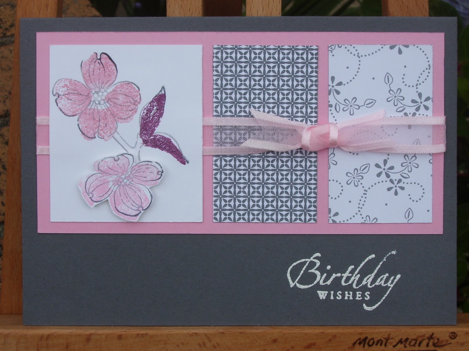
On the original card they had used a Curly Label punch, but once again I reverse masked the Nestabilitles Labels 8, and also added some leaves and used half pearls instead of brads. It turned out better than I had hoped. I had never reverse masked at all before, but I think I will definitely do a LOT more of it.

The box held Judy's favourite indulgance....dark chocolate...and a couple of milk chockies for later on of course!! To complete the look I stamped a plain white paper bag. It look good I think all together. This co-ordination thing has some merit!!


These Top Note boxes are small but I am aware that there are different sized versions around. Judy DID love her pressie and managed to keep (most) of the chocolate from her kids. Give these wee boxes a try...they are very easy and a LOT of fun to make. Perfect size to hold diamond things perhaps girls???

Stuff Used:
CS: (SU) Crumb Cake, Whisper White, Old Olive
Ink: (SU) Rich Razzleberry, Bashful Blue, Whisper White Craft Ink, Versamark
Stamps: (SU) Vintage Vogue, Lovely Letters, Amy R "Birthday Sentiments"
Other bits: (SU) Sizzix Little Leaves Die, Dimensionals, Designer Buttons - Sherbert, Mini Glue Dots, Spellbinders Nestabilities Labels 8 (many of the sizes), Burgandy Grosgrain and Light Blue organdy ribbon fm Alice's, Blue Satin ribbon fm Big W, 1/2 pearls fm stash

Lynda xx


Wednesday, January 12, 2011

Embracing Challenges

I was blessed early in the new year to win a pass to the Inkspirations4U from the delightful Sonia Garbutt. If you are interested in joining this season (Valentine's and Birthday Extraveganza) you can go to her blog and get more detains from there. There are card challenges, colour challenges and projects to share and try...all of which embrace my New Year's Crafting Resolutions!!!

I popped over Monday PM to find the first colour challenge had been posted. Imagine my joy (shock, horror and utter discomfort) when I saw this.......


....a pink toned challenge!!!!

So I procrastinated (mulled, deliberated) over which way I would turn, and by the drive home from work Monday night I had decided that I was going to make the cards with Soft Summer. Havent used it for a long while and it may help ease the pain a little. I laso decided to really give the challenge a GOOD HARD GO and do not 1....but 3 CARDS to make the colours happen.

Card #1.....


I had not tried this border with the slit punch and was very happy with the result. The sentiment was from "Great Friend". The Basic Gray component is only in the outlining of the flowers.

Card #2...


I saw this card on SCS some time back and based it on it. I broke out my Scallop Corner punch for a bit of interest and also stamped the solid image in PIP on the PIP CS to make a self styling DP.

Card #3...


Again....another adaptation of this card I had in my CASE file compliments of Christine Healey.


I cut out an extra flower and popped it up on a dimensional as well as stamping the sentiment in WW Craft Ink and embossing it. All these things I have never done and now I am doing. I guess that is what challenges are all about.

I4U have now posted ANOTHER colour challenge (yeah more pink...LOL) so I am off to tackle that now.

Thanks for enduring this long bonus post. Will be back in the next couple of days with the other colour challenge. I have regular posts scheduled on the "odd days" (I figured blogging every 2 days was enough for all of you!!)

Stuff used:
CS: (SU) Rich Razzleberry, Pretty In Pink, Basic Gray, Whisper White, Select Patterns II DP
Ink: (SU) Rich Razzleberry, Pretty In Pink, Basic Gray, Whisper White Craft Ink
Stamps: (SU) Soft Summer, Sincere Salutations, Great Friend, Whimsical Words
Other Bits: (SU) Scallop Trim Corner Punch, Dimensionals, Slit Punch, Non SU Pink Organza Ribbon, Zing White EP

Lynda xx